|
| | Whats better? |  |
|
+4Ovaiz Clonewars2 stevenF50 Redziggy 8 posters | | Author | Message |
|---|
Redziggy
Adept


Posts : 1853
Registration date : 2008-08-12
| Subject: Whats better?  February 19th 2009, 9:21 am February 19th 2009, 9:21 am | |
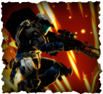
| What one of these is better? 1.  2.  | |
|  | | stevenF50
Super-Human


Posts : 3040
Registration date : 2009-02-09
| | Subject: Re: Whats better? February 19th 2009, 9:22 am | |
| thats hard they are very simmalar number 1 probs | |
| | | | Clonewars2
Adept
Posts : 1913
Registration date : 2008-02-02
| | Subject: Re: Whats better? February 19th 2009, 9:39 am | |
| #1 is better, The other ones have a plain backround. | |
| | | | Ovaiz
Super-Human

Posts : 3059
Registration date : 2009-02-08
| | Subject: Re: Whats better? February 19th 2009, 9:50 am | |
| | |
| | | | Tricky
Vanguard


Posts : 4956
Registration date : 2008-01-26
| | Subject: Re: Whats better? February 19th 2009, 5:59 pm | |
| #2
Number 1 has the logo up close and hard to see. The text is not typed out. The background looks too sharp and rough. The gradient differs too much. Lastly, the light does not fit the image because of how the rest of it is made.
Many users overuse this. The light is to add a 3D-ish look, to finish it all off. If the gradient is wrong, the render is too big, or the text looks bad then the light is useless. | |
| | | | Ovaiz
Super-Human
Posts : 3059
Registration date : 2009-02-08
| | Subject: Re: Whats better? February 19th 2009, 6:01 pm | |
| - Jack Frost wrote:
- #2
Number 1 has the logo up close and hard to see. The text is not typed out. The background looks too sharp and rough. The gradient differs too much. Lastly, the light does not fit the image because of how the rest of it is made.
Many users overuse this. The light is to add a 3D-ish look, to finish it all off. If the gradient is wrong, the render is too big, or the text looks bad then the light is useless. I think I agree with you now. #2 is better! :D | |
| | | | Chargers
Vanguard
Posts : 4319
Registration date : 2008-09-01
| | Subject: Re: Whats better? February 19th 2009, 6:03 pm | |
| Yeah the first one is better. Second one has only one color. | |
| | | | Ovaiz
Super-Human
Posts : 3059
Registration date : 2009-02-08
| | Subject: Re: Whats better? February 19th 2009, 6:04 pm | |
| this thread should have a poll. ;) | |
| | | | Mgmbl311
Vagabond


Posts : 50
Registration date : 2009-02-16
| | Subject: Re: Whats better? February 19th 2009, 6:13 pm | |
| | |
| | | | Redziggy
Adept
Posts : 1853
Registration date : 2008-08-12
| | Subject: Re: Whats better? February 19th 2009, 6:17 pm | |
| - Jack Frost wrote:
- #2
Number 1 has the logo up close and hard to see. The text is not typed out. The background looks too sharp and rough. The gradient differs too much. Lastly, the light does not fit the image because of how the rest of it is made.
Many users overuse this. The light is to add a 3D-ish look, to finish it all off. If the gradient is wrong, the render is too big, or the text looks bad then the light is useless. having the logo like that makes userbars better, you can still easily tell what it is.
well, the text didnt suit all typed out, the background is only two colours? the gradient is only two colours as well.fair enough.
thanks for the constructive criticism :D thanks everyone else. | |
| | | | Mickey4741
Paragon


Posts : 7260
Registration date : 2008-01-27
| | Subject: Re: Whats better? February 19th 2009, 7:51 pm | |
| | |
| | | | Sponsored content
| | Subject: Re: Whats better? | |
| |
| | | | | | Whats better? | |
|
Similar topics | |
|
| | Permissions in this forum: | You cannot reply to topics in this forum
| |
| |
| | Latest News | | Returning to the planet.
|
| Latest topics | » This is the final farewell.September 13th 2024, 4:07 pm by Snow Bunny » Happy Birthday iWaddle/Trainman1405September 13th 2024, 4:03 pm by Snow Bunny » HeyJune 20th 2022, 3:03 pm by Skyward Sam » Back on the planetFebruary 18th 2022, 12:18 pm by Skyward Sam » jesusNovember 26th 2017, 11:11 pm by Name » Taking a trip down memory lane.November 14th 2016, 3:41 pm by Helaina » SurveyAugust 20th 2015, 1:52 pm by FireFalcons1 » Any of y'all down to start a new forum?August 20th 2015, 1:40 pm by FireFalcons1 » SupJanuary 30th 2015, 11:47 pm by Bandit » Hey everyone =)December 14th 2014, 3:11 am by Bandit » HiNovember 21st 2014, 9:05 pm by demetri11 » Hello, everyone.October 21st 2014, 11:50 am by iWaddle» Resurrecting Club Penguin PlanetAugust 6th 2014, 10:02 am by Brennan » What CPP has done for me.July 24th 2014, 3:51 pm by Digit » The Dance Contest High Scores ListMarch 6th 2014, 1:40 am by Cycle22 » I've had enough.February 7th 2014, 6:25 pm by Brennan » yupNovember 21st 2013, 7:05 pm by Thunder » Foxotic New Virtual World For KidsSeptember 7th 2013, 10:36 am by iWaddle» A to ZJuly 1st 2013, 7:49 am by Thunder » Foxotic - NEW virtual world for kids! June 5th 2013, 9:15 am by sammypenguin |
| Who is online? | In total there are 81 users online :: 0 Registered, 0 Hidden and 81 Guests :: 2 Bots
None
Most users ever online was 621 on May 5th 2021, 6:13 pm
|
|
