| | Shadow |  |
|
+10Rifleman-Dlb sevensevenzero Bronze Sjb Linky iSnow Thunder Bam BabyCP Big Sb 14 posters |
|
| Author | Message |
|---|
Big Sb
Retired Staff


Posts : 1822
Registration date : 2008-01-26
| Subject: Shadow  January 18th 2010, 4:11 pm January 18th 2010, 4:11 pm | |
|
Last edited by Big Sb on January 25th 2010, 11:19 pm; edited 4 times in total | |
|
 | |
BabyCP
Hero of Time


Posts : 11025
Registration date : 2008-11-20
| | Subject: Re: Shadow January 18th 2010, 4:13 pm | |
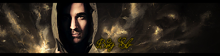
| Not bad at all, not bad at all. ;D Personally, I think if you got rid of the borders or maybe added a small thin border, it would of looked great. They are too thick and maybe adding some text would of worked. 9/10 | |
|
| | |
Bam
Retired Staff

Posts : 8359
Registration date : 2008-02-09
| | Subject: Re: Shadow January 18th 2010, 4:15 pm | |
| Flow is nice, depth could use just a little help, the border is too thick. Nice job! | |
|
| | |
Thunder

Posts : 5403
Registration date : 2008-10-10
| | Subject: Re: Shadow January 18th 2010, 4:15 pm | |
| I sorta agree with BCP. 9/10 | |
|
| | |
Big Sb
Retired Staff
Posts : 1822
Registration date : 2008-01-26
| | Subject: Re: Shadow January 18th 2010, 4:33 pm | |
| I added a new version without the border. ;) | |
|
| | |
BabyCP
Hero of Time
Posts : 11025
Registration date : 2008-11-20
| | Subject: Re: Shadow January 18th 2010, 4:55 pm | |
| Much better. 10/10.  | |
|
| | |
iSnow
Retired Staff
Posts : 3992
Registration date : 2008-11-18
| | Subject: Re: Shadow January 18th 2010, 5:18 pm | |
| I love the 'fat' borders you put on your tags.  Except now, because is too dark to have a thick, black border. The second version is nicer, could use a border tough. Just not too wide like the other one. :P Flow is great, colors match. 10/10 | |
|
| | |
Big Sb
Retired Staff
Posts : 1822
Registration date : 2008-01-26
| |
| | |
Linky


Posts : 5824
Registration date : 2009-04-16
| | Subject: Re: Shadow January 18th 2010, 5:39 pm | |
| I like V2(the one with no border) better. They are both really good though!
10/10
~Linky | |
|
| | |
Bam
Retired Staff
Posts : 8359
Registration date : 2008-02-09
| | Subject: Re: Shadow January 18th 2010, 6:20 pm | |
| Yeah, that hepled, nice job! | |
|
| | |
Big Sb
Retired Staff
Posts : 1822
Registration date : 2008-01-26
| | Subject: Re: Shadow January 18th 2010, 6:41 pm | |
| - Big Linky wrote:
- I like V2(the one with no border) better. They are both really good though!
10/10
~Linky Thanks Linky. - Bambi wrote:
- Yeah, that hepled, nice job!
Thank you Bambi. | |
|
| | |
Thunder
Posts : 5403
Registration date : 2008-10-10
| | Subject: Re: Shadow January 18th 2010, 7:37 pm | |
| I don't like v2 as much. 8/10 | |
|
| | |
Sjb
Retired Staff

Posts : 6980
Registration date : 2008-10-09
| | Subject: Re: Shadow January 18th 2010, 8:39 pm | |
| I'ma rebel, but I don't care, I like V1 best. :P
I like the thick borders and dark colors, that's just my personality...
10/10!
~Sjb | |
|
| | |
Bronze
Vanguard


Posts : 4736
Registration date : 2009-05-24
| | Subject: Re: Shadow January 19th 2010, 2:03 pm | |
| J'adore.
I really like it. Colours and shadows are very well manipulated to fit and the non-border version looks much better than the original. Like Bam said, though, the flow isn't perfect.
9/10 | |
|
| | |
BabyCP
Hero of Time
Posts : 11025
Registration date : 2008-11-20
| | Subject: Re: Shadow January 19th 2010, 2:23 pm | |
| - Cold wrote:
- J'adore.
That's so weird. We were learning how to pronounce J'adore in French today. ;D Looking at it again, I don't see much flow. But I still love the 2nd version. :p | |
|
| | |
sevensevenzero
Hero for Hire

Posts : 1158
Registration date : 2009-03-10
| | Subject: Re: Shadow January 19th 2010, 7:27 pm | |
| It looks good but all is ee is a black bg, a render, and some gold brushes... | |
|
| | |
Big Sb
Retired Staff
Posts : 1822
Registration date : 2008-01-26
| | Subject: Re: Shadow January 20th 2010, 12:30 pm | |
| - -YuNg-StUnNa- wrote:
- It looks good but all is ee is a black bg, a render, and some gold brushes...
It was a stock, not a render. The only brushes I used were the default soft brushes. | |
|
| | |
sevensevenzero
Hero for Hire
Posts : 1158
Registration date : 2009-03-10
| | Subject: Re: Shadow January 20th 2010, 8:19 pm | |
| That doesnt look or sound true at all.. | |
|
| | |
Rifleman-Dlb
Vanguard

Posts : 4869
Registration date : 2008-10-23
| | Subject: Re: Shadow January 20th 2010, 8:28 pm | |
| | |
|
| | |
Bronze
Vanguard
Posts : 4736
Registration date : 2009-05-24
| | Subject: Re: Shadow January 21st 2010, 3:23 pm | |
| - -YuNg-StUnNa- wrote:
- That doesnt look or sound true at all..
Strangely enough, it appears all your signature contains is some red circles with a mask, and drop shadow. | |
|
| | |
Creeper
Forum Legend

Posts : 6961
Registration date : 2008-04-06
| | Subject: Re: Shadow January 21st 2010, 5:49 pm | |
| Please do not take about what other people have created in a topic that isn't about their work. This is a topic about bigsb's signature. | |
|
| | |
Digit


Posts : 2262
Registration date : 2009-02-12
| |
| | |
Creeper
Forum Legend
Posts : 6961
Registration date : 2008-04-06
| | Subject: Re: Shadow January 21st 2010, 10:53 pm | |
| The thinner border looks nice. However, it doesn't need text in my opinion. Maybe an alpha channel though. | |
|
| | |
jjkanes
Hero for Hire

Posts : 1343
Registration date : 2009-04-01
| | Subject: Re: Shadow January 21st 2010, 11:16 pm | |
| I like the thinner border because it looks nicer and also the version ont he second one of Kakaromango posted was nice too nice work! 10/10
| |
|
| | |
sevensevenzero
Hero for Hire
Posts : 1158
Registration date : 2009-03-10
| |
| | |
Sponsored content
| | Subject: Re: Shadow | |
| |
|
| | |
| | Shadow | |
|